The weekend update, including two new reports
The first change you will notice is that sections with sub-pages (such as the content library) now have their own drop-down menu. That is indicated with the caret icon. The reason for this was that displaying those sub-pages horizontally became a problem once the number of them got too large. And with two new reports added within analytics, that was becoming increasingly apparent. The drop-down is more suited to a list as it expands vertically instead of horizontally.
The colour palette has changed slightly too, with the primary control on each page now blue to make it more consistent with the overall style.
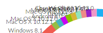
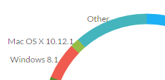
Another minor issue we spotted was that on the pie-charts, if there were many values to show, the labels would quickly overlap and so become impossible to read. Now the pie charts only show the top values (such as the top 5 or top 10). That solves the problem as it means there are fewer segments and fewer labels. The remaining smaller values fill a new “Other” segment. While the top values are likely to be the ones of most interest, the original data-set is still available in the accompanying table.
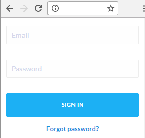
We also fixed a small visual issue with the sign-in panel, where on small screens the responsive layout moved it too far down the page. Now, rather than it being centered, it simply positions at the top of the page:
Along with improving how the reports (analytics) are structured, improving the interface, and renaming them more logically, this update also includes two new report types: a views log, and a report of views per user. You can access those through the usual menu.
The log report provides a summary of recently processed views, providing a more detailed insight (rather than simply x,y values as per other reports, such as views-by-date). For example you can see who watched a video (if known), where they watched it, from which IP address and on which page they watched it. We also show how much of it they watched using the background of the panel to indicate that. The greater the width of the green shaded area, the greater the percentage watched.
The other report, views per user, shows a summary of this data.
Both reports rely on the viewer being known to the system. We are currently adding support for this. Unknown/anonymous viewers will simply show as such.
Finally, we added two new filters within analytics: the ability to limit the report by viewer (their email address, as that is their identifier) and/or the particular video (its id, which again, is its unique identifier):

When combined, those filters become even more useful. For example see which videos were most watched by a particular viewer. Or which viewers watched a particular video.
If you have any more ideas for reporting within the online video platform please don’t hesitate to email us ([email protected]). We can add bespoke features so if there is something you need, simply ask.
Updated: December 5, 2016